Uranium: Interactive World Map
Explore where in the world Uranium deposits are found, and which countries produce the most.
I designed and programmed this interactive for the National Museum of Nuclear Science and History in Albuquerque, NM for a recent exhibit called "What's Up With U?" that's about how Uranium is mined and used for energy production. The exhibit was funded by a grant from New Mexico EPSCoR.
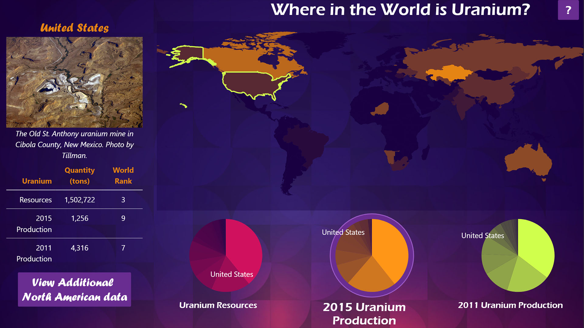
This interactive map allows people to toggle between three different datasets - Uranium resources, and Uranium production from two different years. Visitors can either tap on a country in the map, or tap on slices of the pie charts below it. This highlights one country and shows more information about it on the left-hand side. The colors of the countries on the map change with the data selected.
This was a fun and slightly challenging thing to develop. At first, I was just trying to use jQuery for all of the coloring, but I eventually realized that it just wasn't going to cut it. For some time, I'd been hoping to have a chance to use D3.js in a project, and this turned out to be just the one. D3 makes it easy to do linear interpolation of colors, fancy interactive pie charts, and colorful maps, all in one library. That freed me up to just use Vue.js for the UI components, like the data viewer on the left and dealing with things like timeouts.