Museum of Boulder Beacon Tester
Arguably the most challenging part of the whole Museum of Boulder Tablet Application was getting the beacons to behave as a user would expect. Towards the end of the project, Quatrefoil decided the best way to test the beacons was to develop a duplicate project with everything stripped out besides the beacon output, so that it would be easier to test. I was very excited about this because the main app has a secret debugging window, and from pretty early on I was itching to take the beacon RSSI (Relative signal strength indicator) data and plot it.
As analyzing the output from the beacons became more and more complicated, the code from my main App Vue component grew out of control and it made me twitchy. In addition to wanting to plot the data, building the app also gave me the final push I needed to finally refactor the project and pull all of the beacon output into its own class. I needed to increase the readability so that the programmer at Quatrefoil, Jennifer, could look over what I'd done and make changes without too much difficulty.
I based the whole new project on the debugger window from the tablet application, and then went from there. The different sections are color coded, but there are multiple beacons in each section so it was necessary to create a gradient so you could mostly tell by looking at the graph which beacon was which and which section was which.
![]()
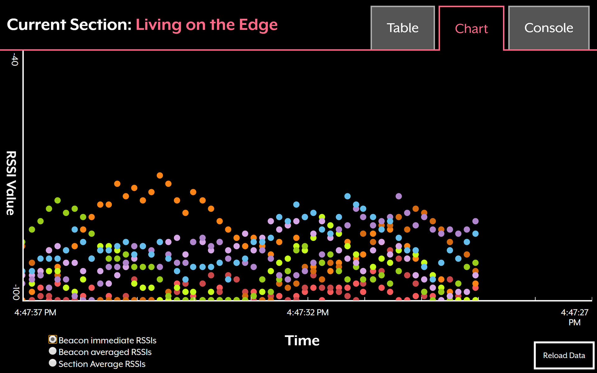
A gif of the Beacon Tester in action. You can see the smoothing process is essential for useful data.
As you can see, the beacon data is smoothed twice in order to get the current section that the tablet is located in. The first pass averages over all valid readings within the last two seconds, and the second pass takes the highest average RSSI beacons in the sections and does a weighted average of those two. A critical part of getting this to work properly was Jennifer increasing the broadcasting rate for the beacons, and ensuring that the scan frequency from the beacon plugin was as frequent as allowed by the Android OS. An article I read about ranging with beacons suggested using 20 seconds of data in order to get accurate results, but this simply isn't doable for any application where you expect people to be walking around. You wind up having to do a difficult dance of accuracy vs. speed, which is both fascinating and frustrating.
The plot of all the data is certainly quite busy and needs a key, so I created an even more colorful version of the debugger window table to go along with it.
![]()
The table with color coded beacon names. If your memory is good, you can connect these beacon colors to the chart.
I used Vue.js and SVG circles to plot the data. Because this was a simple scatter plot, it was simpler to just use Vue and calculate the x and y coordinates of each point rather than going through all the trouble of importing d3.js or some other data visualization library.
I am a visual person, so having the data plotted really drove that point home. The RSSI data from the beacons is quite messy, and it is particularly so in a room filled with metal beams and electronics. It was very useful to show to other people who weren't working directly on the project. I was able to show someone the messy raw output and just say "This is why this is hard" and he understood instantly. That moment justified all the effort in my mind.
